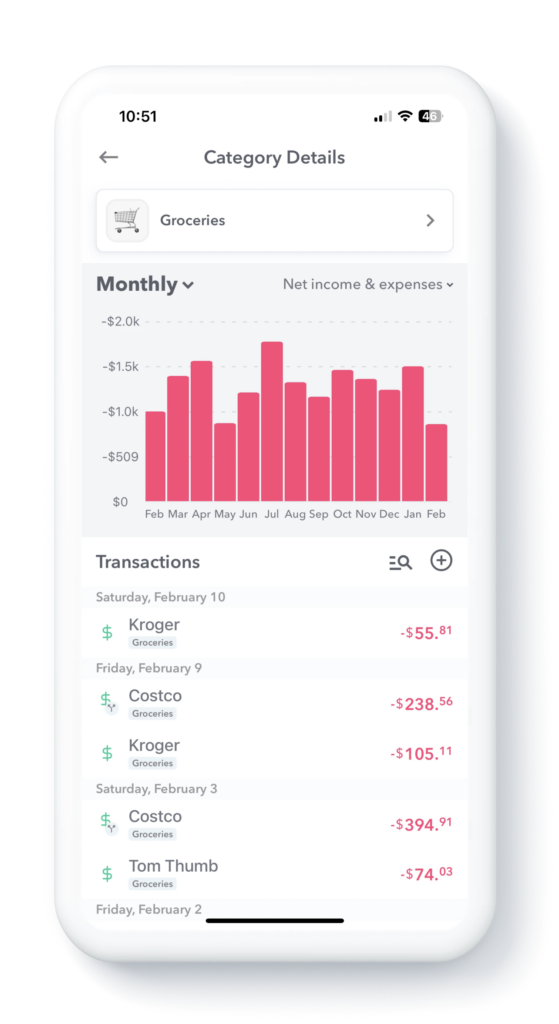
You can see how much you have spent in different Safe-to-Spend categories month-by-month.
To find see these trends first start by ongoing to your Monthly Safe-to-Spend report. Then tap on a category and this will bring up the Category Trend report.
So, if you wanted to see, for example, how much you spent on “Groceries” per month over the past year, tap on “Groceries” in the Monthly Safe-to-Spend report and it will bring up a screen with all your grocery spending.
At the top of the screen you will see a bar graph indicating the spending over time in the category you have chosen and down below you will see a list of all the transactions in that category.
By tapping on different columns in the bar graph, you can select a different months and see the transactions that make up the spending in that category for that month.

Report views
You can also modify the report to see the data in different ways.
Tapping the top left of the report you can change the interval from “Monthly” to “Yearly”.
Tapping the top right of the report will allow you to adjust what transactions are represented in the bar graph: Income Only, Expenses Only, Income & Expenses or Net Total.
Searching for Specific Transactions
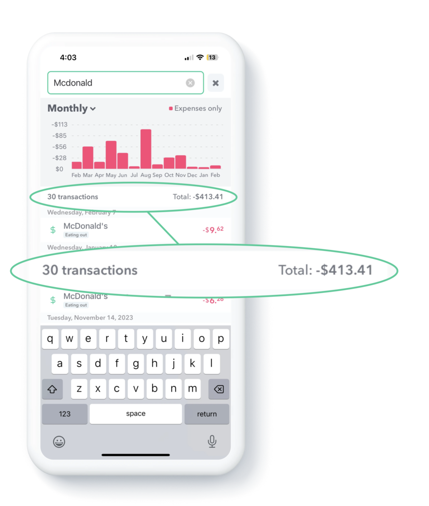
You can also search for specific transactions in the report and the bar graph adjust dynamically. To do this first, swipe down, then type the transactions you are searching for. In the demo below, the user is searching for all the McDonald’s transactions. The bar graph adjusts to show only the McDonald’s transactions and then you can tap different months to see the transactions in those months that are specifically McDonald’s transactions.
Notice also when you enable the search, the report will show the number of transactions that match your search and the total of those transactions.

