Weekly provides a fast way to review transactions by listing each one along with the primary suggestion. You can confirm through transactions quickly by tapping the suggestion destination, or tap on the transaction itself to see the detail and change the destination.
Where to find the Transaction Review List
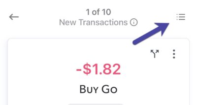
You can find the Transaction Review List by tapping the bullet list icon on the top right of the Individual Transaction Review screen.

Transaction Review List
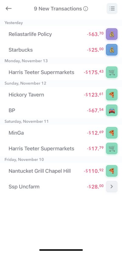
This list has all the unreviewed transactions for the selected week. The label from the bank is on the left, and the amount and the suggestion square are on the right.

Transaction Review Squares
The suggested destination and categorization for a transaction will be indicated in the suggestion squares.

The color of the square indicates the Destination.
- Green indicates a Safe-to-Spend transaction
- Blue indicates a you want it map the transaction to a Fund
- Purple indicates a Recurring Expense budget item
- Red indicates ignoring the transaction
The transaction suggestion is based on the Suggestion rules which can be adjusted.
The emoji in the square indicates which specific category the item will be assigned to. You can setup the emoji associated with categories, funds or recurring expense items on the respective management pages.
So for example, by default Weekly has a pizza emoji to represent the “Eating Out” category and the grocery cart to represent “Groceries”.
Accepting a suggestion
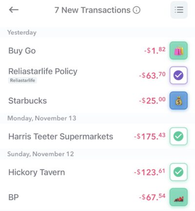
Tap the suggestion square to confirm the transaction. and the icon will be replaced with a checkmark. You can tap it again to revert the change.

If you need to change the destination you can tap on the vendor or anywhere left of the icon and it will bring up the individual review screen again.
The bulk transaction review screen aims to make reviewing new transaction fun and easy. By tapping suggestion squares, you quickly accept Weekly’s destination suggestions allow you to quickly move through your transactions and keep on top of your spending.
